9 head-turning charts, animations, images from investment firm marketers
It’s been too hot to read—instead, this week let’s look at some pictures!
Here’s a shout-out to some of the finest graphics we’ve seen circulating on the socials lately. The set of nine celebrated below is a mix of new and old-but-evolved charts, animations and images produced by asset management and advisory firm marketers over the last few months.
Pour a glass of lemonade and enjoy!
An event marketed like an event
We all know what webcast promotions usually look like—date, time, headshots, and a title that, if we’re being honest, isn’t always the most riveting. And that’s not necessarily on you, marketers, as we know all cross-functional (Marketing, Sales, Investments, Compliance) activities are subject to (ahem) give and take.
That’s why the branding of American Century’s Bonds Untangled quarterly webcast, as seen on X (the social network formerly known as Twitter) breaks out. Looks like it could be promoting a Bond movie, and that’s likely the point. Look how the presenters’ names are treated. Different, well done, hope this creativity results in better than average attendance.
Even fixed income can be fabulous
Charts are the true language of the investment industry. In fact, some charts are so entrenched in investment communications that just about every firm has their own version (Missed the 10 best days in the market, anyone?).
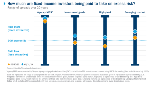
Is it that fixed income doesn’t lend itself to creative marketing? Or is it that for years fixed income didn’t necessarily command a lot of marketing attention? Whatever, fixed income has been basking in the marketing spotlight for the last several months. Example of a chart worthy of the moment: Columbia Threadneedle’s fixed income spread monitor, also promoted on X. This explains a lot.
Lines that bend
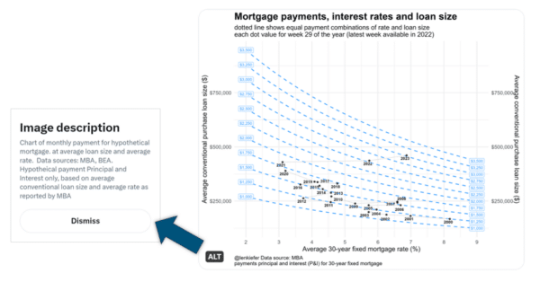
A little further afield but relevant to the overall economy so we’ll allow it: I gasped when I saw this chart from Freddie Mac economist and innovative chart maker Len Kiefer, @lenkiefer on X, which is where I follow him. The lines bend! So much data but easily explained in his brief post: “House price growth accelerating, affordability getting squeezed in the U.S.” In fact, the chart says it all.
Also notice Kiefer’s use of X’s alt badge, a best practice that many have yet to adopt that collapses the chart explanation into a link. He uses it to further explain the chart and provide the additional disclosure. OK at your firm? Check with Compliance.
@lenkiefer on mortgage payments, rates, and loan size
2 variations on a theme
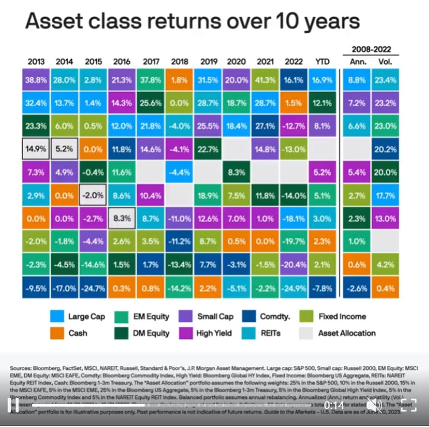
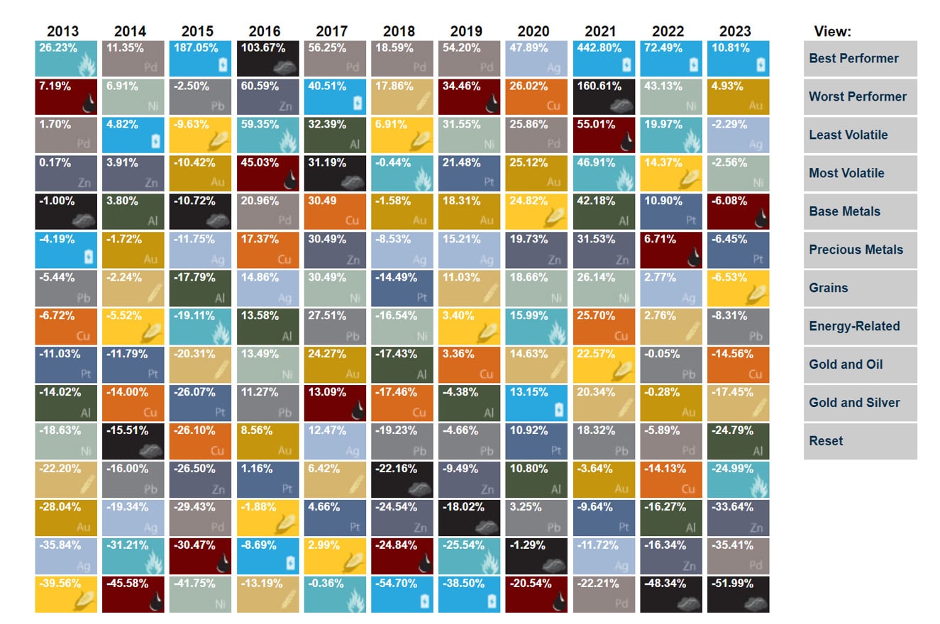
Who was the first fund marketer to appropriate the periodic table of elements to represent something about investment returns? A genius idea since imitated, mass produced—and now evolved. Let’s look at two examples.
In this LinkedIn post, the Guide to the Markets people, J.P. Morgan Asset Management, take the basic idea of the asset class quilt and add some boxing animation that helps focus on the returns across individual asset classes. Way to keep things fresh!
In U.S. Global Investors’ world, the periodic table of investment returns becomes a periodic table of commodities returns. I like this version for its wee commodities graphics and for its added filtering on the right–hand side.
There’s one point to this chart
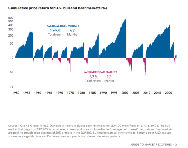
Easily one of my newer favorite market volatility charts, this chart appears in Capital Group’s Guide to Stock Market Recoveries, although it’s appearing in other firms’ communications as well. It’s a powerful way to support the “stay invested” message.
Why does only social get the cute stuff?
Where’s your 401(k) money going? Peel back the top layer of the bar chart and take a look around! This image from Charles Schwab on LinkedIn just tickled my fancy. Of course, I clicked through to see what else was happening on the page. But, then disappointment.
In a trend that’s far from exclusive to Schwab, there’s no continuity between what the social team posted and what the web team published. Sorry to see the silos at work here, though, because that whimsical illustration would have added a lot to just another web page with just another stock photo on it. I say this with love.
Count up, scroll down
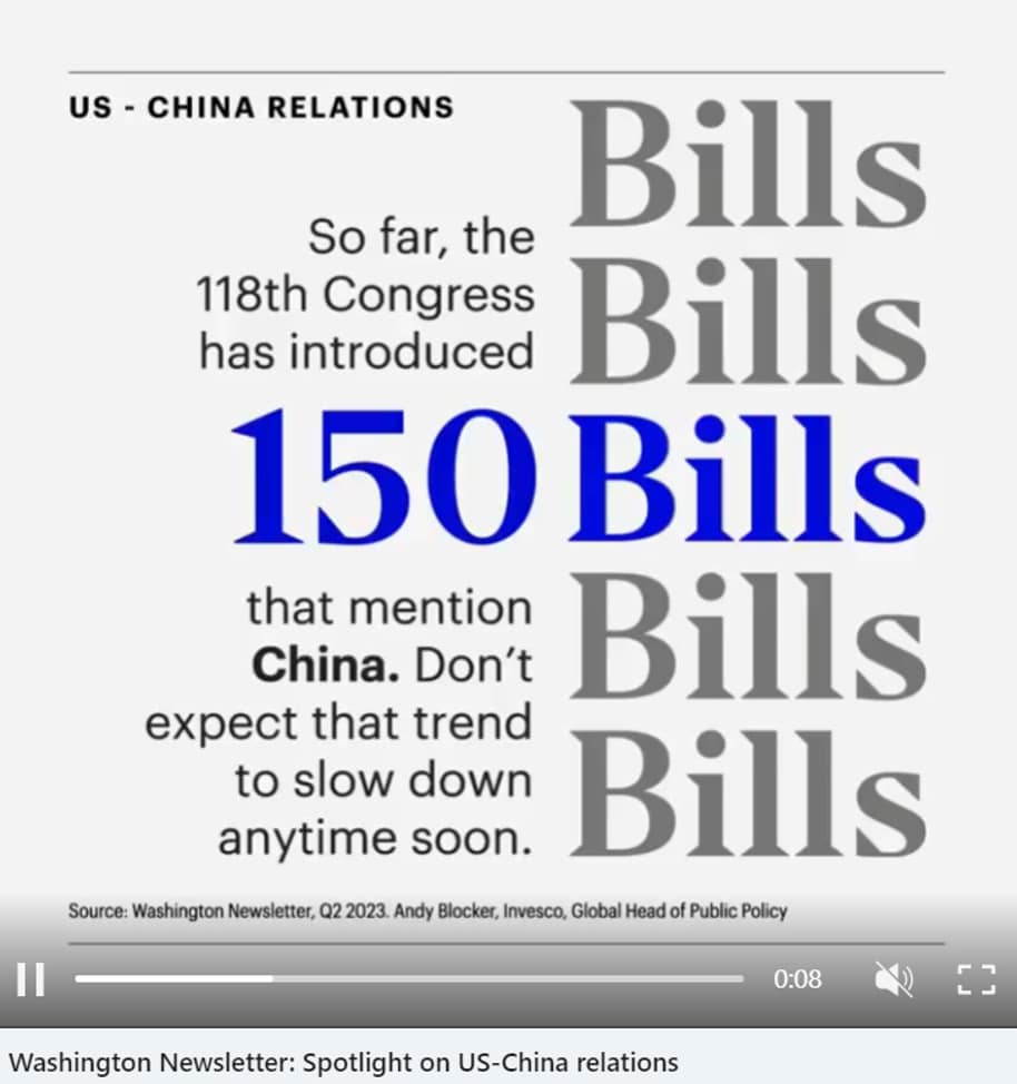
This static image can’t capture the animation in this Invesco LinkedIn post. The counter climbs from 0 to 150 and the word Bills scrolls to the right. Definitely a feed-stopper, and I appreciated the fact that the animation goes two ways.
Moves over time
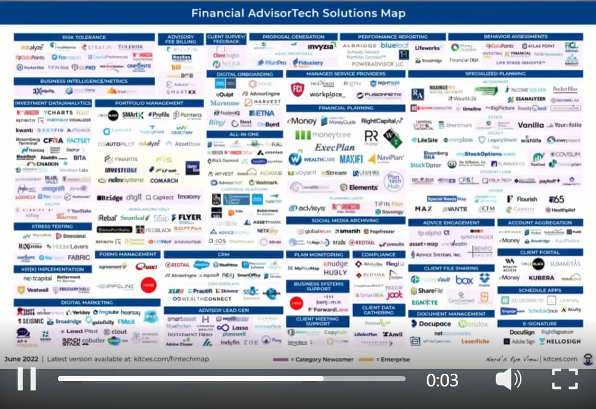
Think again if you don’t think Michael Kitces of Nerd’s Eye View is a marketer. We’re fans of his content work across the board, including what he’s done with the AdvisorTech Solutions Map which tracks advisor adoption of tech tools over time. It’s a fluid space so Michael has animated the tools’ moves in this graphic, promoted on LinkedIn. The screenshot doesn’t do the animation justice, be sure to click to appreciate its full glory.
Lowe Group offers a range of services related to digital marketing, send us a note for more information.
Subscribe.
Receive the latest news and insights from Lowe Group.

